What Information Can Be Gleaned From a Funnel Chart?
Dive into the world of data analytics and visualization to understand how funnel charts tell a compelling story about progression and regression.
With their unique shape and distinct stages, these charts provide an easy-to-understand way to track information flow, monitor performance, and identify potential issues. Keep reading to discover the power and, more significantly, how to interpret the information they provide.
Also Read: Is Leadific Legit or a Scam?
Understanding the Basics of Funnel Charts
At their most fundamental, charts are data visualizations resembling an inverted pyramid. The width of each stage represents the volume at a particular phase of the process, providing an at-a-glance comparison of relative numbers.
These statistics are particularly useful for displaying progression information where stages are decreased systematically. They’re often used to show sales processes, website conversions, hiring pipelines, and more.
The design makes comparisons at each stage relative to the total, emphasizing the cumulative effect. This comparative ability is especially useful in situations where understanding proportions and inter-relationships is pivotal.
A clear understanding of a funnel chart can unlock a wealth of insights from the info it presents, leading to learned data-driven decision-making.
The Importance of Funnel Charts in Analyzing Data
Its importance in analysis cannot be overstated. By visually modeling a series of actions or steps, they provide an immediate understanding of a process’s performance.
They offer a high level of clarity and simplicity in interpretation. With funnel charts, decision-makers can quickly spot process blockages, drop-off points, or stages where prospects convert at a lesser rate than anticipated.
Moreover, to provide a visual summary, they help to highlight the biggest problems facing a process. Identifying these challenges could be the key to improving overall efficiency.
Without a reliable tool, it can be difficult to interpret complex information. This makes them an indispensable tool in the analysis process.
Key Information Displayed in a Funnel Chart

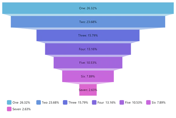
The primary piece of information displayed in a funnel chart is the number of units at each stage of the process. This translates into understanding where volume is lost or, in a sales context, where potential customers drop out of the process.
Another significant piece of information conveyed in the infographic is the conversion rate between stages. This is key for analyzing efficiency and identifying areas where improvement is needed.
They also readily display the total conversion rate from the first stage to the last, allowing for an immediate assessment of overall performance. In essence, the key information gleaned from the chart describes the performance of a process in detail with just a quick look.
Practical Application: Using Funnel Charts in Decision-Making

Funnel charts play a significant role in decision-making processes. They allow decision-makers to identify areas where improvements can be made or resources can be better allocated.
In the sales context, a visual graph can indicate at which stage prospects are likely to drop off. This information enables strategic decisions about where to focus marketing and sales efforts.
Similarly, in hiring processes, these stats can help a hiring manager visualize where candidates tend to drop out. This enables strategic decision-making around improving the candidate experience or adjusting screening methods.
Ultimately, they lend actionability to raw facts and figures, proving their worth in every decision-making process.
Altogether, funnel charts prove to be a highly effective tool in analytics and decision-making. It does not matter if you diagnose your process efficiency, optimize your resources, or highlight areas for improvement, the insights gained from the graphs can lead to significant improvements and measurable success.
Issues When Creating a Funnel Chart
Compiling data and information from the dataset and visualizing it with precision is not an easy task. In order to present the right information along with interactive graphics, you need to face numerous challenges. Some of those challenges are listed below:
Maintain Consistent Stage Spacing
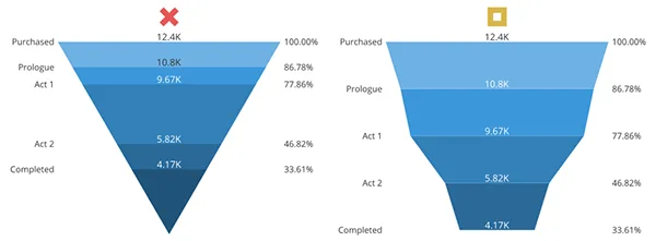
Whenever preparing a funnel chart for your great business presentation, you must put emphasis on showing the significance of a particular element. In the left graphic, you can see the different elements or stages, but the graphic on the right shows the proper listing of several elements and their degree of involvement.
Use a Bar Style Funnel Chart
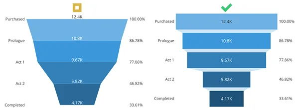
The data will look more presentable and compelling if you organize it well. Like in the example above-pasted, you can see slanting lines connecting two segments, whereas the graph on the right organizes them all in a proper bar graph creating a funnel.
Match Labels to Measured Locations
The whole point of a presentation is to present the right facts and statistics in such a way that it should be precise and accurate. The more their value increases or decreases at the next stage, the graph should be able to adapt to that change.
Whereas when labeling each stage with its value, this unmeasured practice can cause a huge blunder and can create a mess. Therefore, it is recommended to match labels according to the measured locations.
Final Words
Funnel charts are a great and fabulous alternative to creating and presenting information visually. Whereas there are a number of alternatives like bar graphs, pie charts, flow charts, etc. However, all of these presentations can be more interactive when you have a funnel chart in your presentation.

Exploring Common 2-Story Houses Energy Usage Patterns and…

How Long Does It Take to Obtain An…

The Secrets Behind High-Performance Racing Windows

Co-Parenting Strategies for Divorced or Separated Parents in…

How Auto Lawyers Help Victims of Distracted Driving…

How Can an Attorney Help in a Trucker…

What is the Rule of Thumb for Pipes?

Best DVD Rippers for Windows & Mac: Free…

Reducing the Impact of Unexpected Construction Expenses

8 Ways to Improve Wi-Fi Speed and Stability…

Essential Strategies to Make Hotel Management Easier

Puppy Power: Raising a Happy and Healthy Pup…